Readability is the capacity to which a person can read a passage of text and understand and recall what they just read. Here are some tips for improving the readability, presentation, and expressiveness of your writing on the web.
1. Write For The Web
Reading on the web isn’t easy. Computer monitors have low screen resolutions, and the light they project quickly fatigues our eyes. Plus, many websites and applications are built by people without formal typography or graphic design training.
Here are some pointers to consider during the writing process:
- The average user will read at most 28% of the words on a web page, so make the words you use count. We suggest that our clients cut their copy in half and then in half again. We know this makes their inner Tolstoy cry, but their readers will appreciate it.
- Use clear, direct, and conversational language.
- Avoid marketese, the exaggerated boastful language that fills bad advertisements (e.g., Hot New Product!). Instead, provide useful, specific information.
- Keep paragraphs short, and limit yourself to one idea per paragraph.
- Use bullet lists
- Use the inverted pyramid writing style, keeping your most important information at the top.
2. Organize Your Content With Subheaders
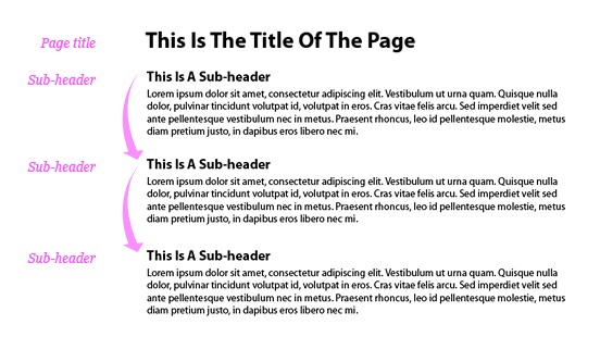
Sub-headers are very important in allowing the user to disseminate a page of content visually. They divide the page into manageable sections and declare what each section is about. This is important to a user who is scanning the page to find what is most important.
Subheaders also create a visual flow that allows users to move their eyes downward across the content.

Try limiting the main body of your web page (excluding navigation, footer, etc.) to three sizes: page title, sub-header, and body copy. Make the contrast between these styles clear and effective. Too little contrast in size and weight will make the elements clash rather than work together.
When writing, make sure sub-headers condense the point of the text they represent to a handful of words, and don’t assume the user has fully read the section above or below. Avoid overly cute or clever language; clarity is critical. Meaningful and beneficial sub-headers will keep the reader engaged and invite them to continue reading.
3. Communicate With Formatted Text
- Italics: You can use italics for emphasis and to suggest vocal inflection in a more conversational tone. For example, “I told you I saw a monkey” has a different meaning from “I told you I saw a monkey. “
- All Caps: People read by making out the shapes of words rather than computing words letter-by-letter. For this reason, text in ALL CAPS is more challenging to read because it disrupts the shapes of words we are used to seeing. Avoid using it for long passages of text or entire sentences.
- Bold: Bold can make portions of your text stand out, but try not to overuse it. If you have a large blob of text that needs to be emphasized, try using a background color instead.
4. Negative Space Can Be Oh-So-Positive
The appropriate amount of space between lines of text, between letters, and between blocks of copy can greatly improves reading speed and comprehension. This white (or “negative”) space is what allows people to distinguish one letter from the next, associate blocks of text with each other, and keep track of where they are on the page.
As you look at the page, squint and blur your eyes until the text becomes indecipherable. Does the page divide neatly into sections? Can you tell me what the header for each section is? If not, you may need to rework your design.
Additional Resources:
- How Little Do Users Read? by Jakob Nielsen
- How To Write Exquisite Subheads by Brian Clark
- 10 Principles For Readable Web Typography by Matt Cronin